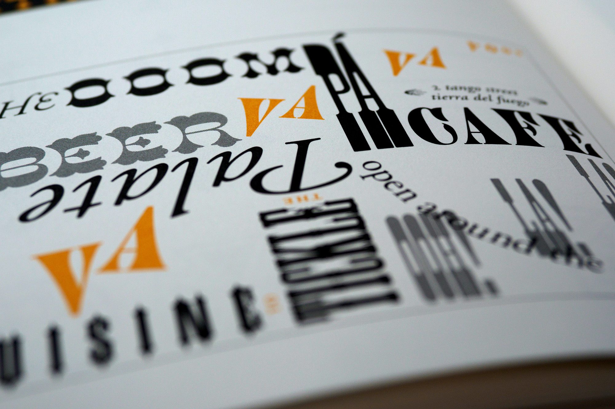
Typography in Graphic Design: A Beginner’s Guide
Typography is an essential aspect of graphic design that plays a crucial role in creating visual appeal, communicating the message, and enhancing the user experience. Typography refers to the art and technique of arranging typefaces, fonts, and text in a visually pleasing and readable way. In this beginner’s guide, we will explore the fundamentals of typography in graphic design and provide some tips on how to use typography effectively.
Choosing the Right Typeface:
The first step in creating an effective typography design is selecting the right typeface. There are countless options available, so it’s essential to understand the characteristics of different typefaces to choose the one that best suits your design.
Some popular typefaces include serif, sans-serif, script, and display. Serif typefaces have small lines or flourishes at the ends of the strokes, whereas sans-serif typefaces do not. Script typefaces mimic handwriting, and display typefaces are often used for headlines and titles.
Typography Hierarchy:
Hierarchy is the organization of elements in order of importance, and it’s a critical aspect of typography design. It helps guide the viewer’s eye to the most important information and enhances the visual appeal of the design.
For example, you might use a larger font size and a bold typeface for the headline, and a smaller font size and a lighter typeface for the body text. This will create a clear visual hierarchy and make it easier for the viewer to read and understand the information.
Contrast:
Contrast is the difference between two elements, and it’s an important aspect of typography design. You can create contrast using different typefaces, font sizes, colors, and styles.
For example, you might use a bold typeface for the headline and a lighter typeface for the body text. You can also use contrasting colors to create visual interest and enhance the readability of the text.
White Space:
White space, also known as negative space, refers to the areas of the design that are left blank. It’s an essential aspect of typography design as it helps to create a balance between the text and the other elements in the design.
For example, you might use more white space around the headline to make it stand out and less white space around the body text to create a sense of continuity.
Consistency:
Consistency is key to creating a cohesive typography design. You should aim to use the same typeface, font sizes, and styles throughout the design to create a sense of unity and coherence.
For example, you might use the same typeface for the headline and the body text, and use the same font size and style for all the subheadings.
In conclusion, typography is an essential aspect of graphic design, and it’s essential to understand the fundamentals to create effective designs. By choosing the right typeface, creating a typography hierarchy, using contrast, white space, and consistency, you can create visually appealing and easy-to-read designs that communicate your message effectively.
For other marketing methods, you can download these two e-books at the following link:
Do you need a marketing plan?


Sorry, the comment form is closed at this time.